6of 6

Bij het opzoeken vanluciferetiketten is het verschil soms nauwelijks zichtbaar op de foto. Er wordt wel verwezen naar de cataloog, maar omdat ik die niet heb is het moeilijk om het juiste artikel aan te bieden in de shop. Voorbeeld G. Verweij in de Groenendijk cataloog 1999 V3-18 en V3-19.
Heeft het soms met de papierkleur te maken?
Kan iemand mij wat uitleg geven.
Alvas bedankt;
Heeft het soms met de papierkleur te maken?
Kan iemand mij wat uitleg geven.
Alvas bedankt;
Message is in Dutch
Translate to EnglishWhen looking up match labels, the difference is sometimes barely visible in the photo. There is a reference to the catalogue, but because I don't have it it is difficult to offer the right item in the shop. Example G. Verweij in the Groenendijk catalog 1999 V3-18 and V3-19.
Does it have something to do with the paper color?
Can someone give me some explanation?
Thanks in advance;
Does it have something to do with the paper color?
Can someone give me some explanation?
Thanks in advance;
Message has been translated from Dutch
Show original message
Collectioneur
SUPER
- Catalogue manager
- 5,353 messages
- March 01, 2024 15:57
1K
added
100K
prices
25
info pages
500K
reviews
5K
posts
March 01, 2024 15:57
Message is in Dutch
Translate to EnglishMessage has been translated from Dutch
Show original message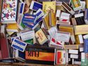
janmaas
VIP
- Catalogue administrator
- 22 messages
- March 01, 2024 18:49
10K
added
100K
reviews
25
posts
March 01, 2024 18:49
Dat is inderdaad een probleem bij deze etiketten (zg Mignonetiketten), deze zijn in grote getale op de markt gebracht. Er werd geen cliché gemaakt, dus als de klant een nieuwe partij doosjes bestelde werd een nieuwe mal gemaakt. De plaats van de letters en cijfers konden dan wel verschillen met het oorspronkelijke etiket. Of al deze bijzonderheden ook in de catalogus staan weet ik niet, ik heb die catalogus ook niet. Misschien kunnen verzamelaars uit België hier iets aan toevoegen, deze etiketten kwamen vooral voor in België. Ik weet niet of de genoemde catalogus een Nederlandse of een Belgische uitgave is.
Message is in Dutch
Translate to EnglishThat is indeed a problem with these labels (so-called Mignon labels), which have been marketed in large numbers. No cliché was made, so when the customer ordered a new batch of boxes, a new mold was made. The position of the letters and numbers could then differ from the original label. I don't know whether all these details are also in the catalogue, I don't have that catalog either. Perhaps collectors from Belgium can add something to this, these labels were mainly found in Belgium. I do not know whether the catalog mentioned is a Dutch or Belgian edition.
Message has been translated from Dutch
Show original message
fazerco
VIP
- Catalogue administrator
- 2,406 messages
- March 01, 2024 19:17
5K
added
2.5K
prices
25
info pages
100K
reviews
2.5K
posts
March 01, 2024 19:17
In dit geval staat er Amsterdam-C. en Amsterdam/C. Dat is het verschil gok ik.
Message is in Dutch
Translate to EnglishIn this case it says Amsterdam-C. and Amsterdam/C. That's the difference I guess.
Message has been translated from Dutch
Show original messagejanmaas
VIP
- Catalogue administrator
- 22 messages
- March 01, 2024 19:53
10K
added
100K
reviews
25
posts
March 01, 2024 19:53
klopt
Message is in Dutch
Translate to EnglishCorrect
Message has been translated from Dutch
Show original messageBedankt
Message is in Dutch
Translate to EnglishThank you
Message has been translated from Dutch
Show original message6of 6